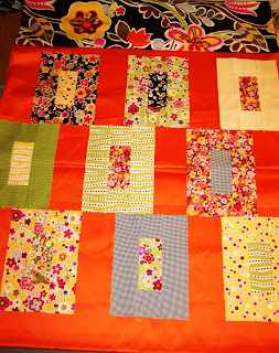
This is why quilting is a group sport. Sometimes you just can't make up your mind! I can't decided between setting options 1 and 2. Thoughts? I welcome opinions from my quilting and non-quilting friends/family alike!
Option 1, offset with wide orange strips:
Option 2, orange sashing with corner squares:
The photos aren't that great, but I took them in the basement last night. If I had my quilt wall up, the pictures would have been much better. Ahem.....


7 comments:
I like option #1, with the offset rows. It looks more interesting.
I like option 2. I like the uniformity.
My vote is for the modern look of #1. It has clean, strong lines and the eye is not interested in anything but the large squares of fabric.
Have to vote for Option #2. It calms the fantastic prints and bright orange a bit. I love the Oz. I will be making a small quilt with the charm squares in a class next week.
I like the second one it seems to flow better, the orange seems to overpower the blocks in the first one.
I vote for the cornerstones - agree with Andrea - it calms it down a bit. Although I do love an offset setting... Depends how bright the orange is in real life...
I like option #1, with a black inner border, orange flange border, then border print. Nothing like a specific opinion!
Post a Comment